Remember when Twitter swapped the bird for a lowercase ‘x’ and we all spent a week pretending it was a bold strategic move instead of a mid-life crisis? History doesn’t repeat, but it definitely rhymes, and Mark Zuckerberg is currently humming a very strange tune.
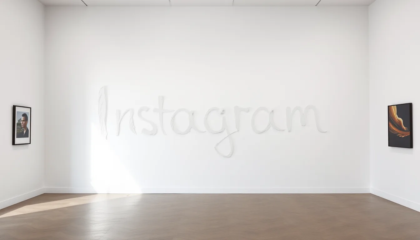
Instagram just rolled out a new wordmark. For a platform that literally sells the concept of “the aesthetic,” the new look is a baffling choice. According to The Verge, the change is subtle to some and illegible to others. It doesn’t look like the old wordmark, and in some iterations, it barely looks like it spells “Instagram” at all.
Who actually asked for this? The old wordmark was iconic—not in the sense that it was a work of art, but in the sense that it was recognizable. You don’t mess with a visual anchor unless you’re trying to signal that the product itself is becoming something else. (Probably designed by a committee of twenty people).
This isn’t just about a font change. It’s a symptom of a larger, more frantic energy coming out of Meta. When a company starts tinkering with its most basic visual assets without a clear “why,” it’s usually because the internal identity is fractured. They want to be a social network, but they also want to be an AI company, a VR hardware shop, and a digital town square all at once. This is a visual identity crisis in real-time.
Changing a logo because it “looks old” is a weak excuse. It’s like a Michelin-star restaurant suddenly deciding to serve its food in plastic buckets because the porcelain plates felt too 2010. It doesn’t improve the food; it just confuses the guests. We are seeing the “blanding” of the internet reach its logical conclusion: a state where brands are so terrified of being dated that they remove all personality until they become invisible.
The friction here isn’t just aesthetic. There is a psychological cost to these constant pivots. Every time the branding shifts, the user is reminded that the platform is no longer the thing they signed up for. We’ve already dealt with the latency of AI stickers and the weirdness of AI-generated search results that hallucinate half the facts. Now we have a logo that feels like it was generated by a prompt that said “make it modern but not too modern.”
It’s a mess.
Let’s be honest about what’s actually happening here. Meta is in a desperate rush to scrub the “social media” stench off its products and replace it with “AI agent” prestige. Zuckerberg is currently obsessed with Llama and the idea of every user having a personalized AI persona. This is the AI pivot signal.
If you look at the trajectory of the last few months, the visual changes are precursors. First, the AI stickers, then the AI search integration, and now a wordmark that feels disconnected from the original photography-first brand. They are prepping the ground for a version of Instagram where the “gram” part of the name is almost irrelevant. They are moving away from the camera and toward the chatbot.
By Q4, we will see this new branding tied directly to a mandatory AI-driven interface overhaul that pushes traditional feed browsing into the background. The logo isn’t meant to be “beautiful” or even “readable” in the traditional sense; it’s meant to be a blank slate. It’s a way of saying “this is no longer just a photo app” without having to actually write a press release that admits the photo app is dying.
We’ve seen this play before. When a company stops caring about its legacy brand equity, it’s because they’ve already decided that legacy is a liability. They aren’t iterating on Instagram; they are trying to erase the parts of it that don’t fit into the Llama-centric future. (I might be overthinking the font, but the timing is too loud to ignore).